Chádrez — Specialty Tea Store

Role
Front-end, identity and packaging
Stack
Shopify · Liquid · JavaScript · HTML5 · CSS3
Reposition tea for a younger audience under the playful tagline 'Porque chá não é coisa de velho' (because tea isn't just for old folks), with a clean, modern brand presence.
What we did
In 2024 we built a custom Shopify storefront with category navigation for teas and accessories, product cards, detail pages with a brewing video, a side cart and a nationwide free-shipping banner. In 2025 we did the rebrand (a new icon cut from the wordmark, the visual system and the packaging) and the landing page for the limited Christmas edition, now online as a demo.
We wrote the Shopify storefront in custom Liquid, so a young tea brand would not look like one more template store.
Product · 2024
Each tea got a whole page, with specs, a brewing video and a side cart, so buying never leaves the product.
Identity · 2025
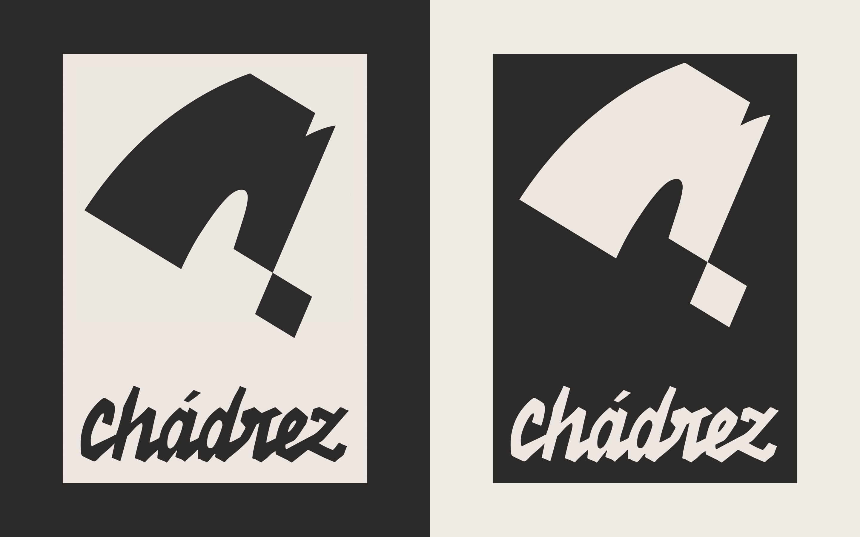
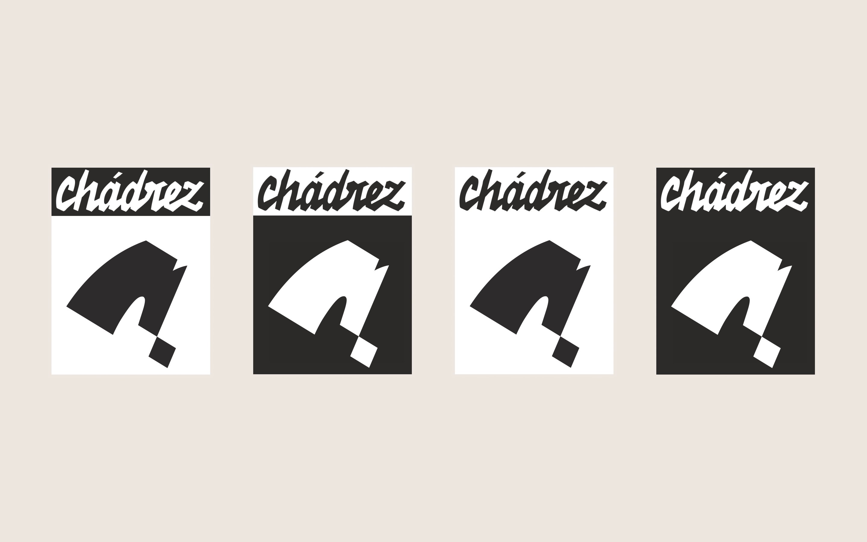
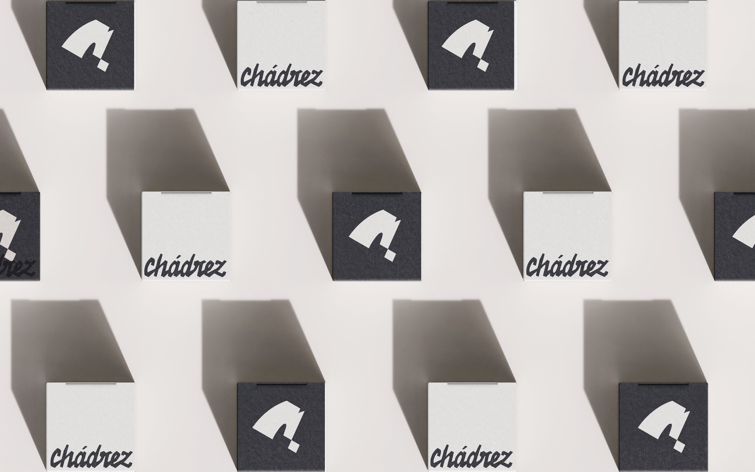
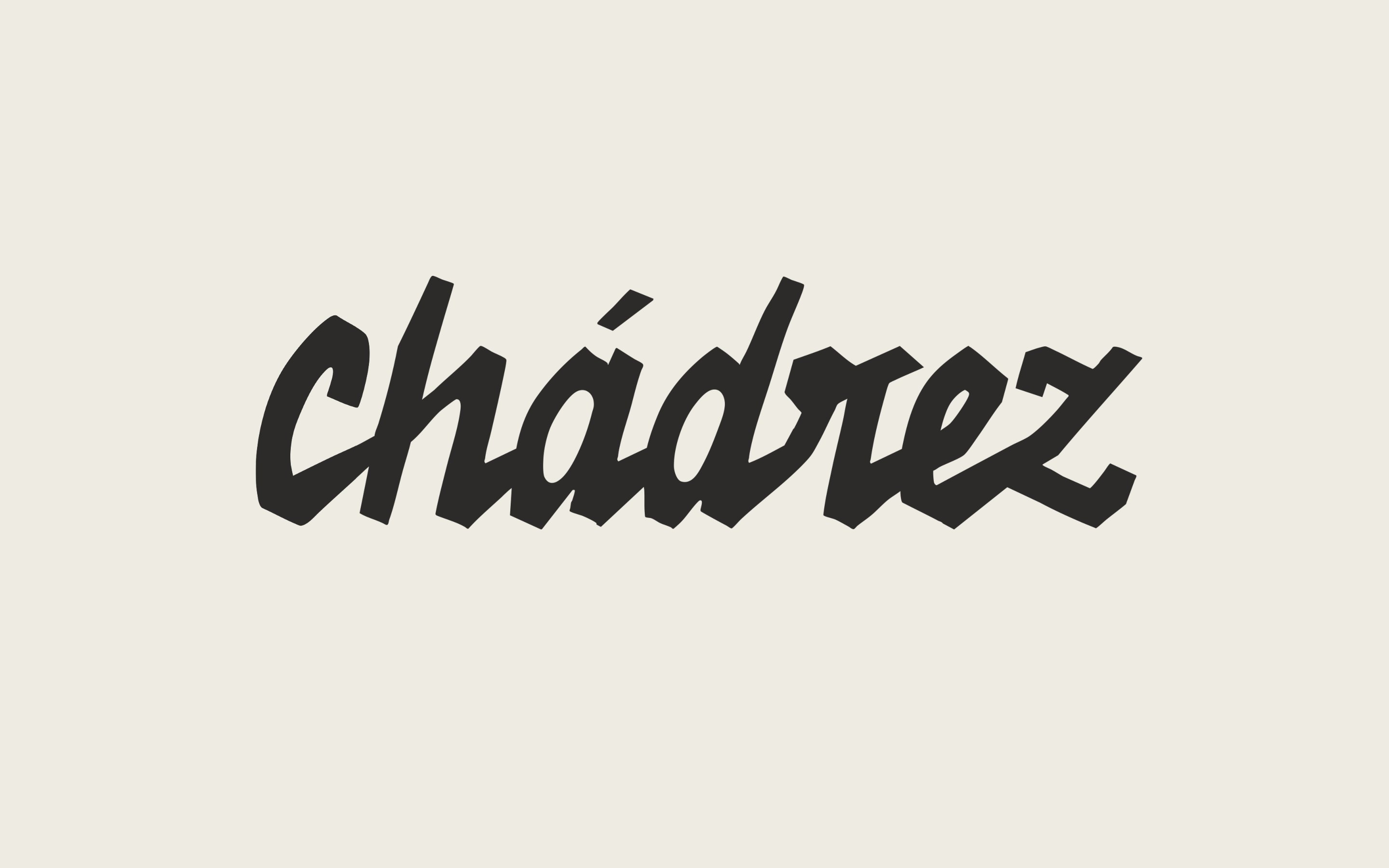
In 2025 we started from the wordmark's C: the store's rounded knight became an icon of straight cuts and one board square.




System · 2025
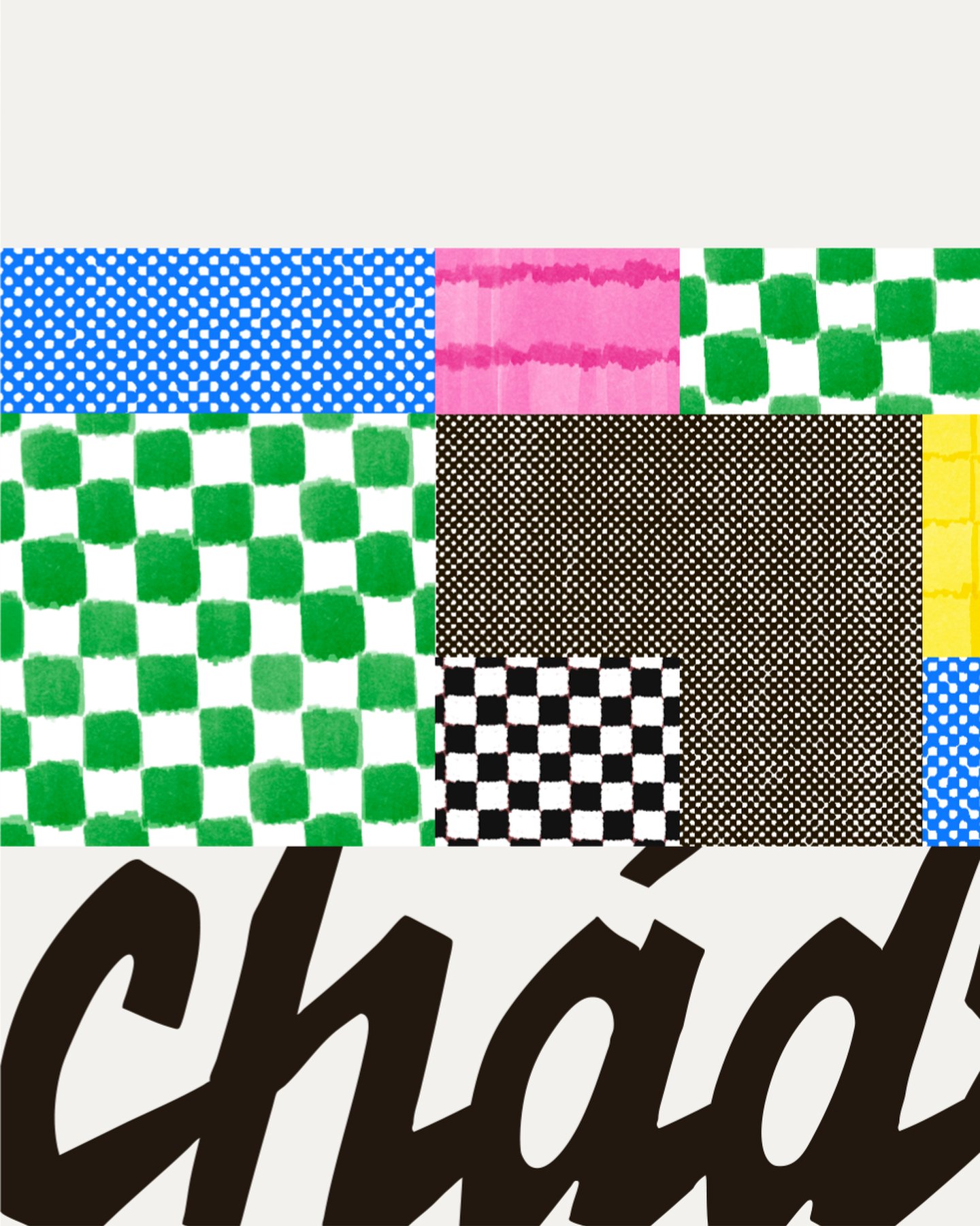
We took colour from the mark and gave it to the flavours: graphite on cream for the icon, a patchwork for the range.

Applications · 2025
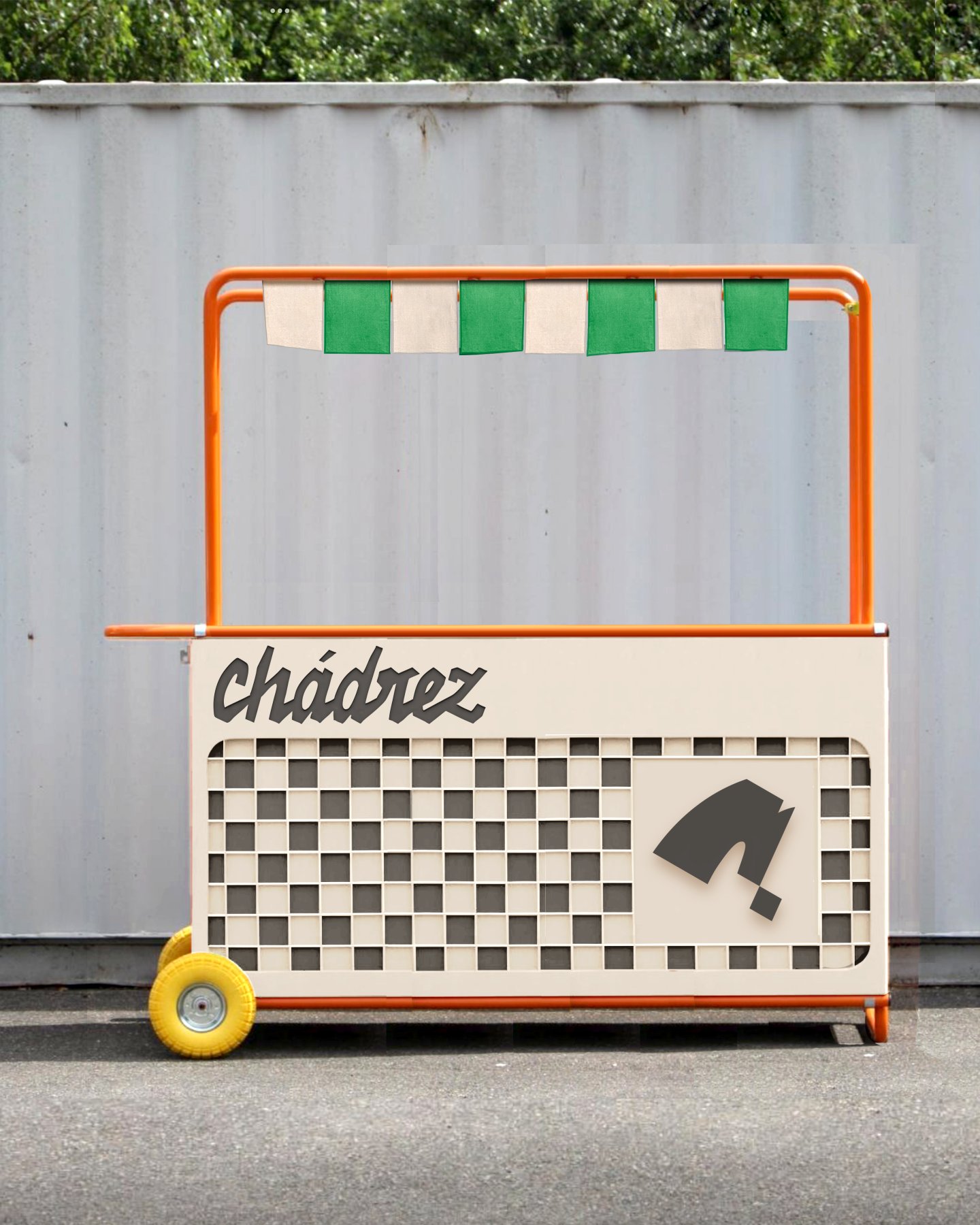
We chose to alternate light and dark like board squares on every piece, and to give each flavour an illustrated chess piece.


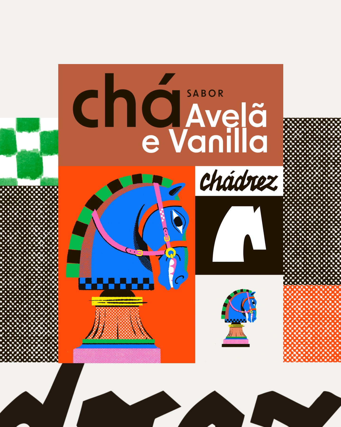
Hazelnut and vanilla label
Hazelnut and vanilla brings back the icon's knight, now illustrated in colour. In version 02 the patchwork turns grey and colour stays on the label alone.
Product · 2025
For Christmas 2025, a limited-edition landing page: the tin in the snow, a carousel pinned to the scroll, the wordmark below.
Results
Custom Liquid Shopify store, live since 2024
Catalogue with product pages, brewing video and side cart
2025 rebrand: new icon, visual system and packaging
2025 Christmas landing page online as a demo, at chadrez-lading-page.vercel.app
Credits
- Shopify store (2024)
- Ressolv
- Rebrand and packaging (2025)
- Ressolv
- Christmas landing page (2025)
- Ressolv
Next project
Rodrigo Baraldi — Personal Brand Landing Page